Why Italian typography is so captivating
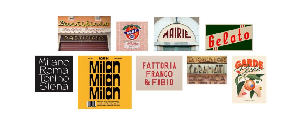
Ciao! To help with the wanderlust, today I bring escapism to you in the form of Italy. And a whole bunch of beautiful, bold words. For those of you who aren’t Italian typography nerds like me, you may be more interested in the products sitting underneath these signs. Or even just this snapshot from La Dolce Vita with the signage subtly in the background (also… Anita Ekberg with a kitten on her head).
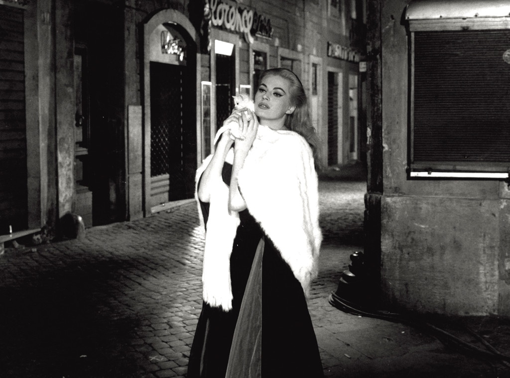
There is a particularly whimsical nature about Italian brands and the identities they hold. Let alone the font systems that are used to showcase them. The signage for retail and café environments often bold, bursting with personality and quite frankly (at least for me) — unforgettable references to unique typography. One favourite of mine is Roscioli, the down right delicious and all-round food haven in central Rome (did someone say, Gricia?).
Italian typography: then and now
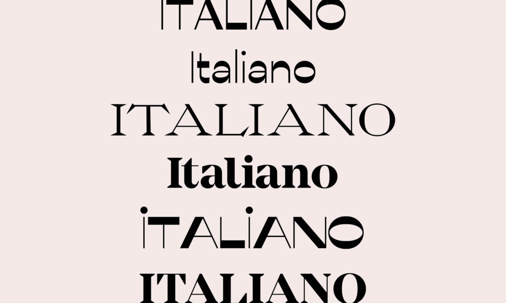
Starting back at day dot, in this case 1821, the influence of the original ‘Italian’ type face can be seen through loads of contemporary and ‘trendy’ versions we’re using today. For example, look at the connection between the ‘Italian’ and Mirador? Or Misto, Ribes and ever ‘of the moment’ Messapia Regular?
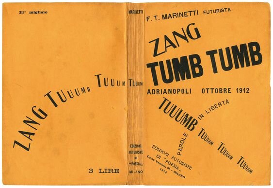
The poetry book, ‘Zang Tumb Tumb’, is famed for where we first see a more playful typographic trend. Published in 1914 by Filippo Marinetti, the founder of Futurism. The typography by Cesare Cavanna, and definitely still standing strong. You can read more about it on the Guggenheim’s website.
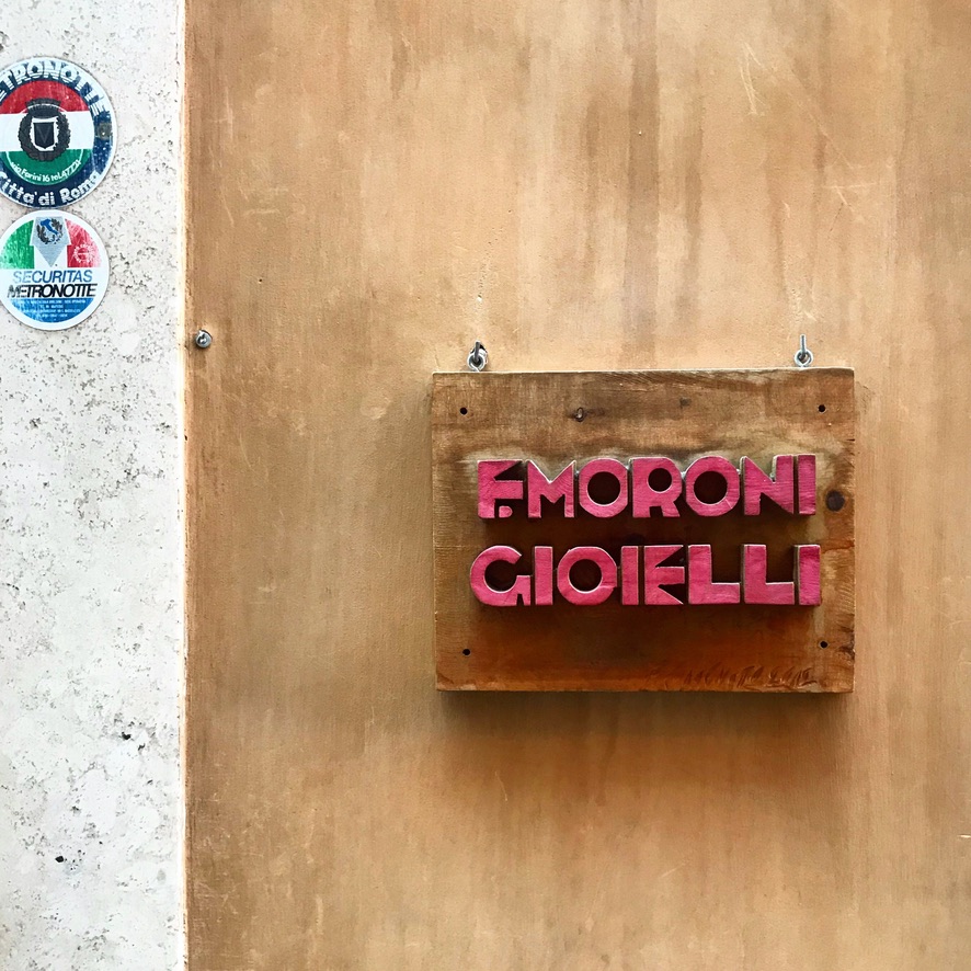
But, back to origins for a second. The ‘Italian’ type face was a derivative of traditional Woodcut typography. One such famed Italian sculptor, who is known for some of his unique, woodcut sign installations in central Rome, is Ferdinando Codognotto. I first came across Ferdinando’s work when in Rome on a recent trip. I took photographs of a sign out the front of jewellery shop, F. Moroni Gioielli near Piazza di Spagna. But that is just my guess… delightfully, the proof is nowhere to be found online.
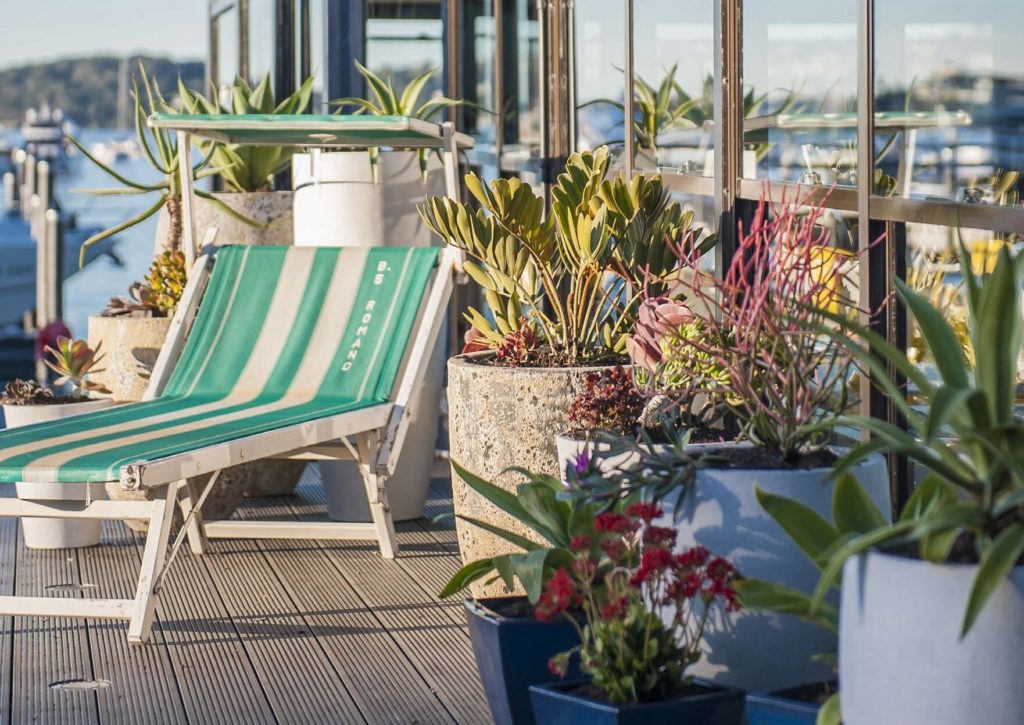
Influence of post-war recovery on Italian typography
The majority of the signage we see in Italy echos the Art Deco and Futurist movements. Steven Heller – lecturer at the School of Visual Arts in New York City, and once long-time art director at The New York Times – has a great take on this style.
“What defines a typeface as Futurist is the mass and dynamic direction of the letters, an aerodynamic quality… Because of the variegated styles on the single page, the rectilinear hand-drawn nature of the faces, and decorative material, the overall impression raucous with a lively Mediterranean spirit.”
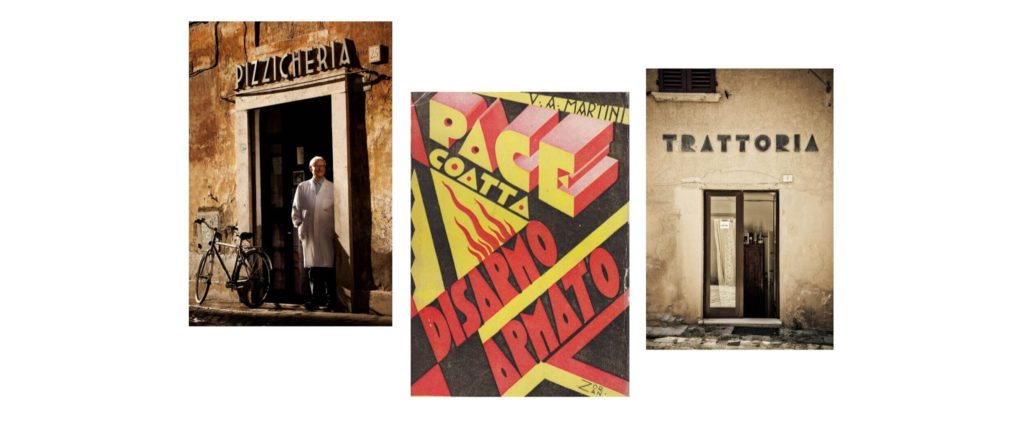
In the post-war recovery and eventual boom, innovation around each of these collective styles was prevalent in Italy. So much so, they carried through across shop fronts, packaging and printed documents. The beautiful, sublime and curious could be seen on broad scale too. From the cosmopolitan Italian cities of Rome and Milan, the luxury inclined jet-set who would frequent Lake Como and the Amalfi Coast, and the raw honesty of Naples: the contemporary design sensibility of this country strengthened.
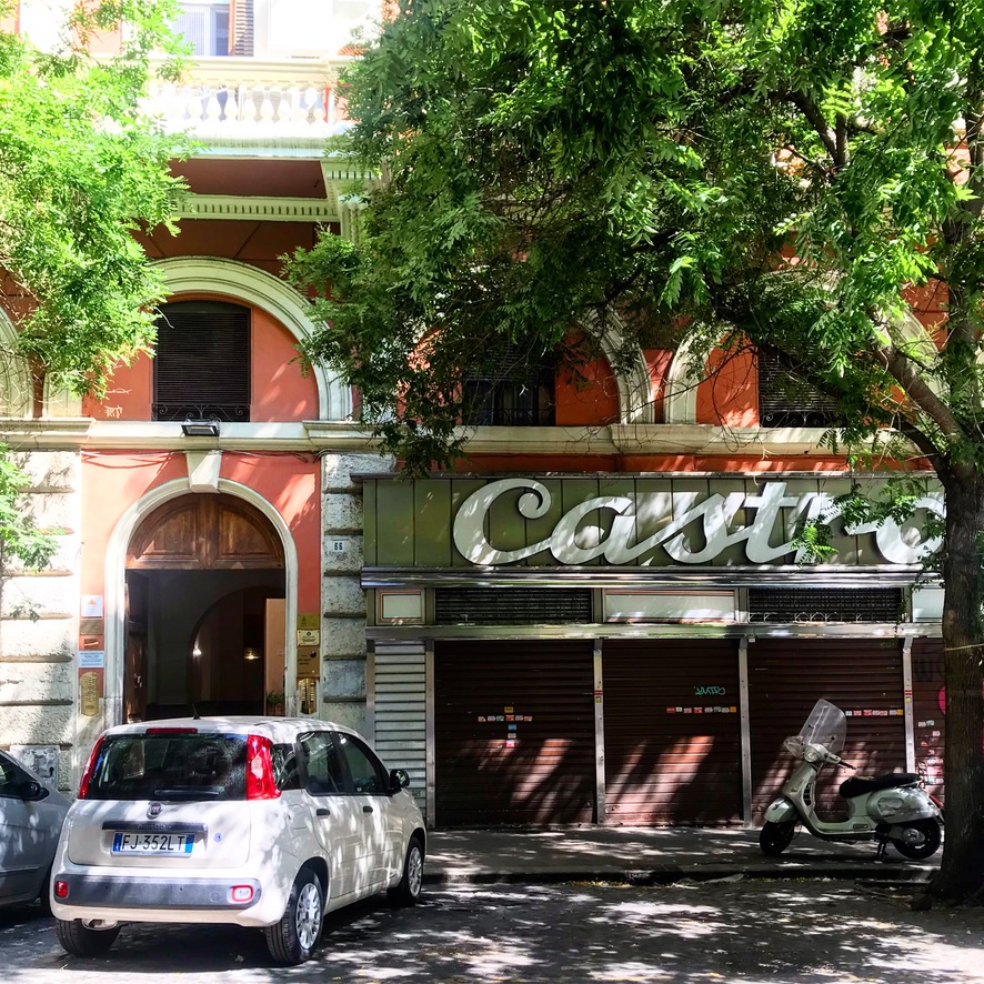
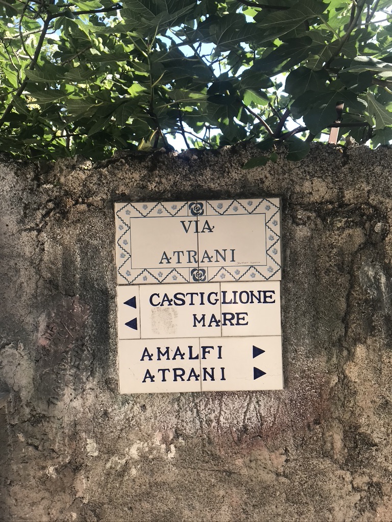
We feel the vibrancy of this country, from top of the boot to the heel. Even from our lounge rooms as we watch Stanley Tucci indulge over pasta. I leave you to explore these images which evoke the feeling and familiarity of Italy, and its affection for typography.
Buon viaggio!
Keen to learn more about typography and the anatomy of letters? Check out my blog post on six elements of typographic design every brand leader can learn.
Brand Identity Design
Collateral Design
At OAM Design Co., I will craft a charismatic brand experience for your business which delights your community.
Based in London, UK Collaborating with clients worldwide.
